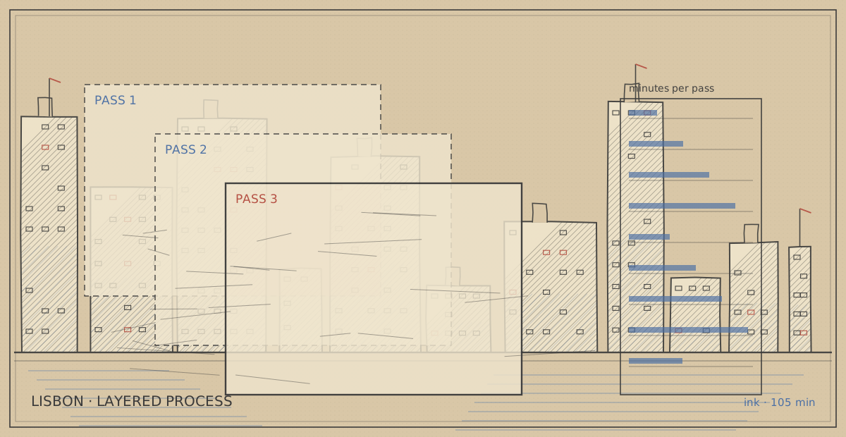
Three ink passes on one street, timed honestly
A shopfront street in Lisbon drawn in three deliberate ink passes, each with its own pen and its own job, so that when the page goes wrong I can tell which pass is at fault instead of rewriting the whole approach.
Place card — Rua dos Remédios, Lisbon
| Kind | Layered process |
|---|---|
| Coordinates | 38.7139, -9.1315 |
| Country | Portugal |
| Medium | Ink |
| minutes on site | 105 min |
| Tools in the bag | Sakura Pigma Micron 045 · Sakura Pigma Micron 025 · Stillman & Birn Alpha A5 · 0.5 mechanical pencil |
| First published | 1 Sep 2026 |
The schedule, and why the passes are separate
The point of separating passes is diagnosis. If outline and hatching live in the same session with the same pen, a failed page tells you nothing. Three passes with three tools means the failure has an address.
| Pass | Pen | Minutes | What it is allowed to do | What it must not do |
|---|---|---|---|---|
| 1 | 0.5 pencil, 2B | 14 | Proportions, edge lines, floor line | Any detail smaller than a window |
| 2 | Micron 045 | 38 | Every outline that defines a shape | Texture, shadow, or tone of any kind |
| 3 | Micron 025 | 41 | Hatching, shopfront type, grime | Re-outline anything from pass 2 |
| 4 | Micron 045 again | 12 | Re-weight the three darkest corners | Anything new |
The rule that makes it work is the one in the last column: no pass may do another pass's job. Pass 2 is where most drawings die, because the temptation to add a little tone while the pen is already in your hand is enormous.
Pass 1 — pencil, 14 minutes, and no detail at all
Pencil is for the two things ink cannot fix: where the vanishing point sits, and how wide the street is relative to its height. I mark the eye level with a faint horizontal line across the whole page and then ignore it. Everything else is four or five long straight lines.
The failure mode of this pass is over-drawing. On the first attempt at this street I spent thirty minutes on pencil, drew in the shop signage, the awnings, the doorway mouldings, and then spent the entire ink session tracing my own pencil. The drawing was *accurate* and completely dead, because pencil detail has a softness that ink cannot reproduce, and tracing it produces ink lines with no conviction. Fourteen minutes is the cap. When the timer goes I put the pencil away in the bag, not in the pen loop.
Pass 2 — 0.45 outline, 38 minutes, the pass that decides the drawing
This is where the page either has structure or does not. The 0.45 goes down on: the street edges, every building corner that turns toward the viewer, window and door openings, and the two awning edges. Nothing else. No window frames, no shop names, no brick joints.
Two things are worth knowing about this pass. First, it is the only pass where line weight variation is allowed — a building corner that is closer gets a heavier stroke, and I get that by pressing slightly rather than by going over the line twice, because doubling a line always reads as a correction. Second, the pen must not be lifted for a run of more than about 40 cm; a single continuous stroke along an entire shopfront is what makes the drawing read as one structure instead of a set of parts.
Where it broke down here: the awning on the right. It is a shallow diagonal running away from the viewer, and every time I drew it as a straight line the awning read as a flat plane rather than a fabric sagging between two poles. I redrew it three times before admitting that a sag needs three separate strokes — pole to low point, low point to low point, low point to pole — with the middle one slightly bowed.
Pass 3 — 0.25 hatching, 41 minutes, and the only pass that can be overdone
Hatching gives the page its tone. The 025 is thin enough that a hatch at 1 mm spacing reads as grey rather than as lines, which is the entire trick.
Three rules I hold to. Hatch direction follows the form, not the light: a wall recedes, so its hatch runs along the recession, and the tone comes from spacing rather than from crosshatching. Do not crosshatch a lit surface, ever — the moment a second direction appears on a sunlit wall, the wall turns grey and the light in the drawing dies. And leave the paper alone in the brightest 10% of the page; a truly unhatched white shape next to a dense one is worth more than any amount of careful gradation.
Shopfront lettering went in during this pass, with the 025 held vertically. Portuguese shopfronts have very consistent hand-painted letterforms with a heavy downstroke, and drawing them at actual size with a single stroke per letter reads far better than trying to draw outlines of letters.