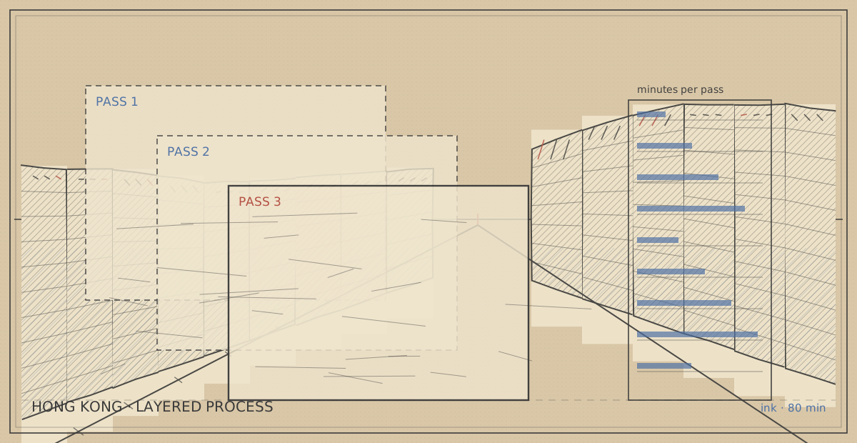
Drawing a Mong Kok crowd by drawing almost none of it
The instinct at a busy crossing is to draw people. That instinct produces a page of forty individually drawn figures who all look like they are standing still, which is the exact opposite of what a crowd looks like.
Place card — Mong Kok, the pedestrian crossing at Sai Yeung Choi Street
| Kind | Layered process |
|---|---|
| Coordinates | 22.3193, 114.1694 |
| Country | Hong Kong SAR |
| Medium | Ink |
| minutes on site | 80 min |
| Tools in the bag | Sakura Pigma Micron 05 · Sakura Pigma Micron 045 · Kuretake brush pen · Stillman & Birn Alpha A5 |
| First published | 17 Oct 2026 |
The count, and the decision it forces
| Measure | Number |
|---|---|
| People crossing in 80 minutes | roughly 400 |
| Seconds each person is in the frame | 3 to 6 |
| People drawn individually | 6 |
| People indicated as marks | roughly 60 |
| Total marks used for all of them | under 900 |
Four hundred people at three to six seconds each is a subject you cannot draw the way you draw a building. The decision is not "how do I draw people faster" — it is "what is the smallest mark that still registers as a person in the corner of an eye".
Pass one: the street, drawn with nobody on it
Forty minutes, and no figures at all. The crossing, the kerb, the shopfronts, the two lamp posts, the railing, the road markings, the pavement. This is the pass that decides whether the drawing works, because a crowd drawn over a badly built street is just noise on a mistake.
The one thing to get right here is the *gap*. A crowd of four hundred compresses into a band across the middle of the page, and that band's height and position decide everything about the final drawing. Mark the band's top and bottom in pencil — for this crossing it was roughly 7 cm tall, between the far kerb and the near kerb — and draw the street around it, leaving it empty.
Pass two: the six people who are drawn
Six figures get drawn properly: the ones who stand still. A man waiting with a trolley, two people at the lights, a vendor, a woman looking at a phone, and one person sitting on a bollard. They are drawn in ninety seconds each, and they are the only figures in the drawing with feet.
Their function is scale and anchor. Without at least a few fully drawn figures, the crowd marks have nothing to be measured against, and the page reads as a texture study rather than a crowd.
Pass three: the crowd, as a value and a rhythm
The remaining three hundred and ninety people are drawn as marks in one of four registers, and never as outlines.
| Register | Mark | Used for |
|---|---|---|
| Near, still | A full figure, thirty seconds, mostly unshaded | The six anchors |
| Near, moving | A torso and legs, no head detail, drawn in one continuous stroke | People within 5 m |
| Middle | A vertical stroke with a slight curve, head as a dot | The main band |
| Far | A short vertical tick, no head | Beyond the far kerb |
The middle band is where the crowd actually happens, and the trick is that the marks must be *unevenly spaced*. Real crowds clump: four marks together, then a gap, then seven. Evenly spaced ticks read as a fence, and that single error kills more crowd drawings than anything else.
Direction matters too. In the band, about 60% of the marks lean the way the pedestrian flow is going, and the rest are stationary or crossing. Drawn at 05 weight, wet, the leaning marks smear slightly and produce a sense of movement that no amount of careful figure drawing achieves.
The four things to leave out
Each of these costs ten minutes and makes the drawing worse:
- Faces. At three seconds per person, a face is a fiction, and a drawn face pulls the eye to one person in a crowd that is specifically about nobody
- Individual bags and shopping. One or two, as anchors; forty is clutter
- Shadows under people's feet. They turn a moving crowd into a static one
- Colour. The page is ink only, and the crowd reads better for it — colour in the crowd band makes each mark a separate person again
What I would do differently: start the band's top edge 1 cm lower. The far kerb figures ended up too tall relative to the drawn anchors, which makes the crossing look narrower than it is.